Out to the 50 this evening with Kentucky cut into the West end zone.
-
-
^ I can't tell. It's pretty dark in there right now.Comment
-
Funny gerntz
Comment
-
Can't wait to see it when it is all done.....Have tickets for Oct 3rd game..hoping to get moreComment
-
Commonwealth is going to be rocking this season. Well, it better be!Isaiah 5:20Comment
-
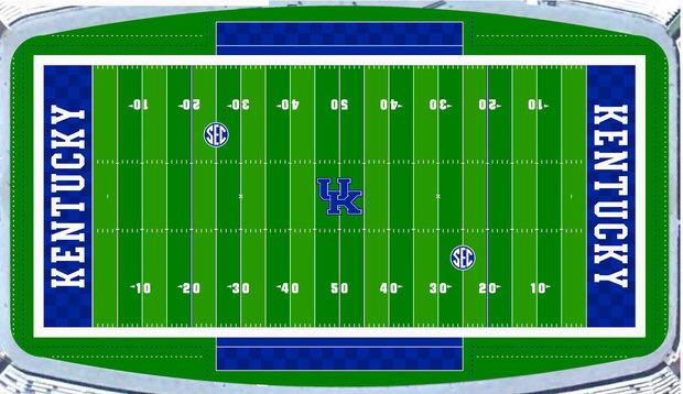
Bumping an old thread, but this is probably the best place to post this...
It looks like the midfield logo ended up being pretty-much the same size as the rendering that was released in May. In other words, too small, but at least the white border is thicker, which is good. I hate the new "UH" logo they're switching to, though. It was changed so that the "H"...er, "K"...would better "fit" with the "U", but it looks odd. If anything, the SEC logos are larger than in the original rendering.

Comment

Comment